I initiated this project after several years of working on Kelso's Choice projects one by one. Kelso is a K-5 school counseling brand. Primarily known for the flagship conflict management program, we later added character building, and emotional regulation programs. Both of those have their own branding subordinate to this top level brand kit.
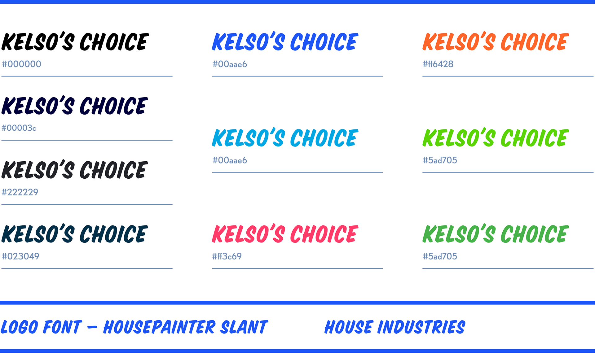
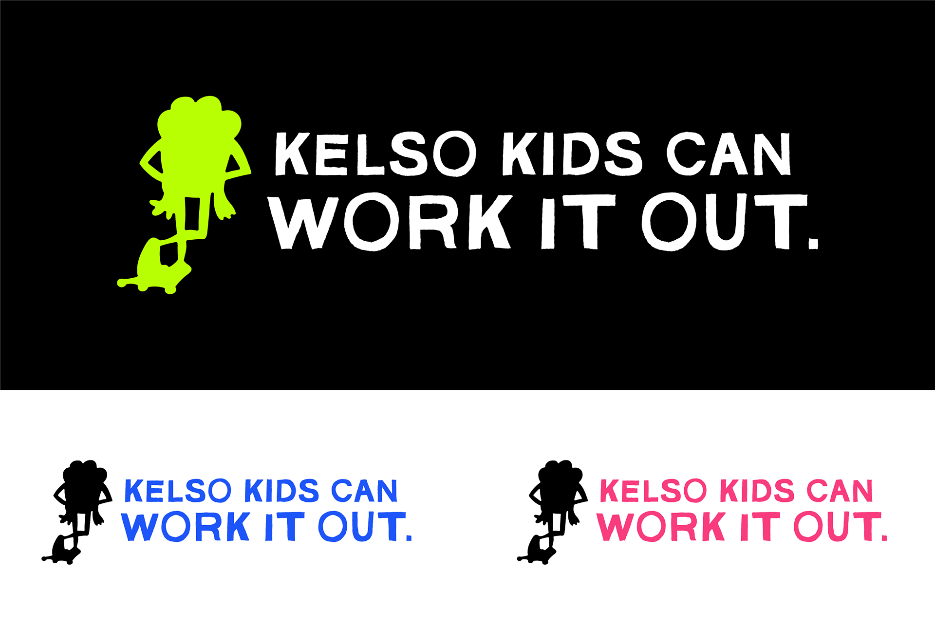
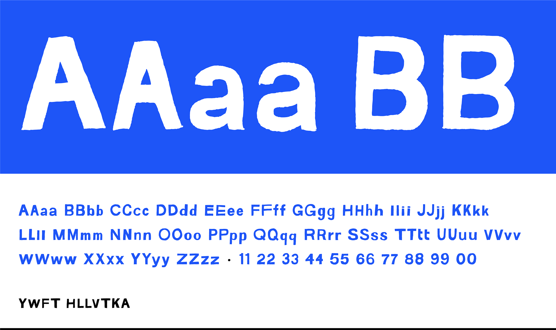
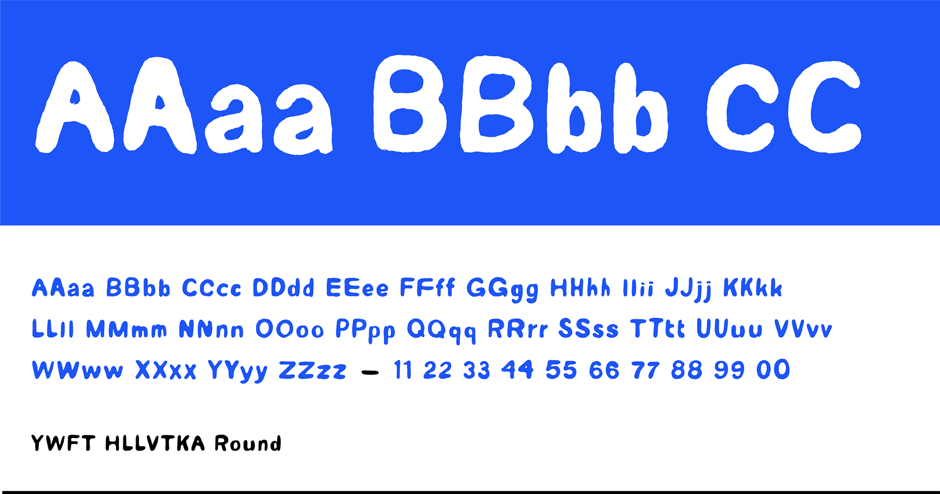
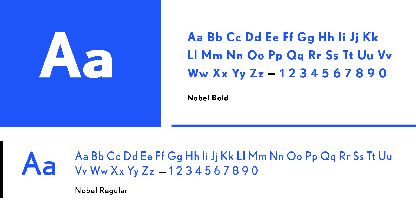
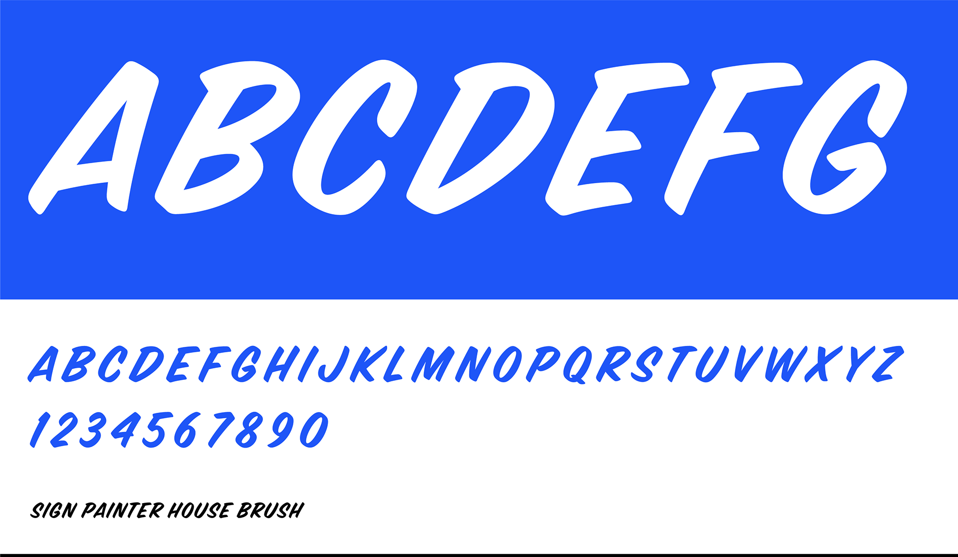
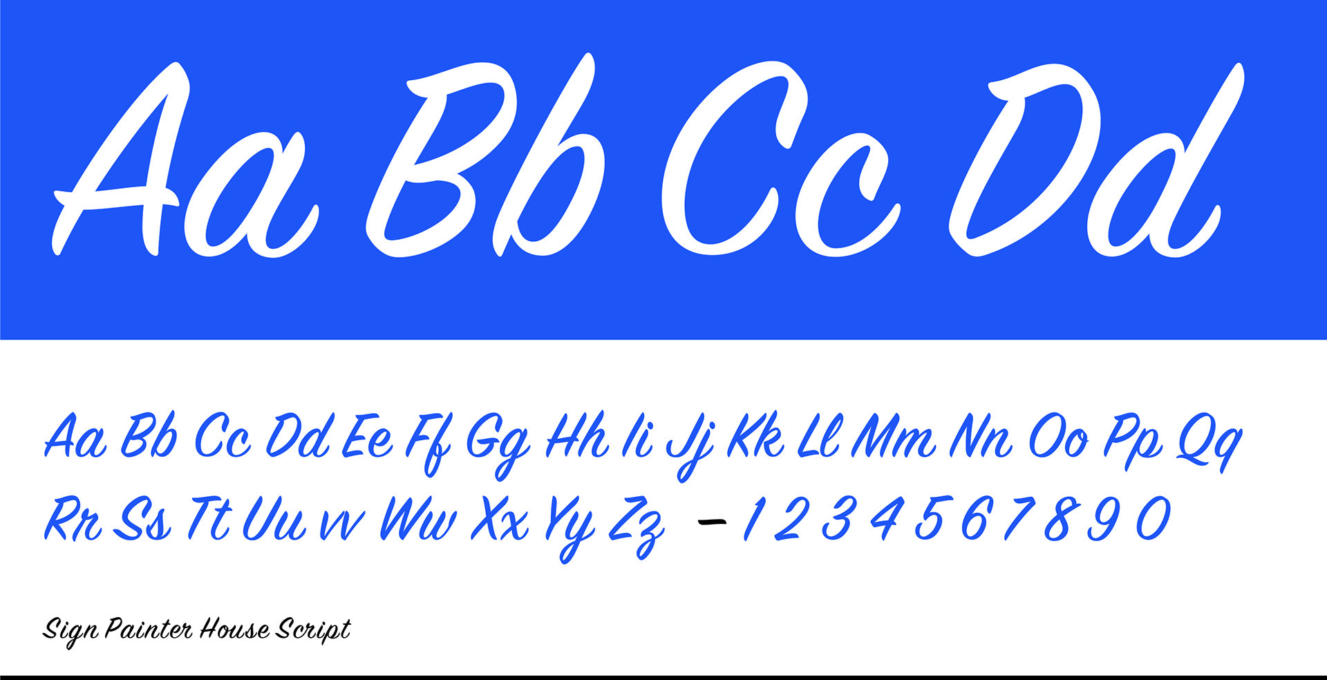
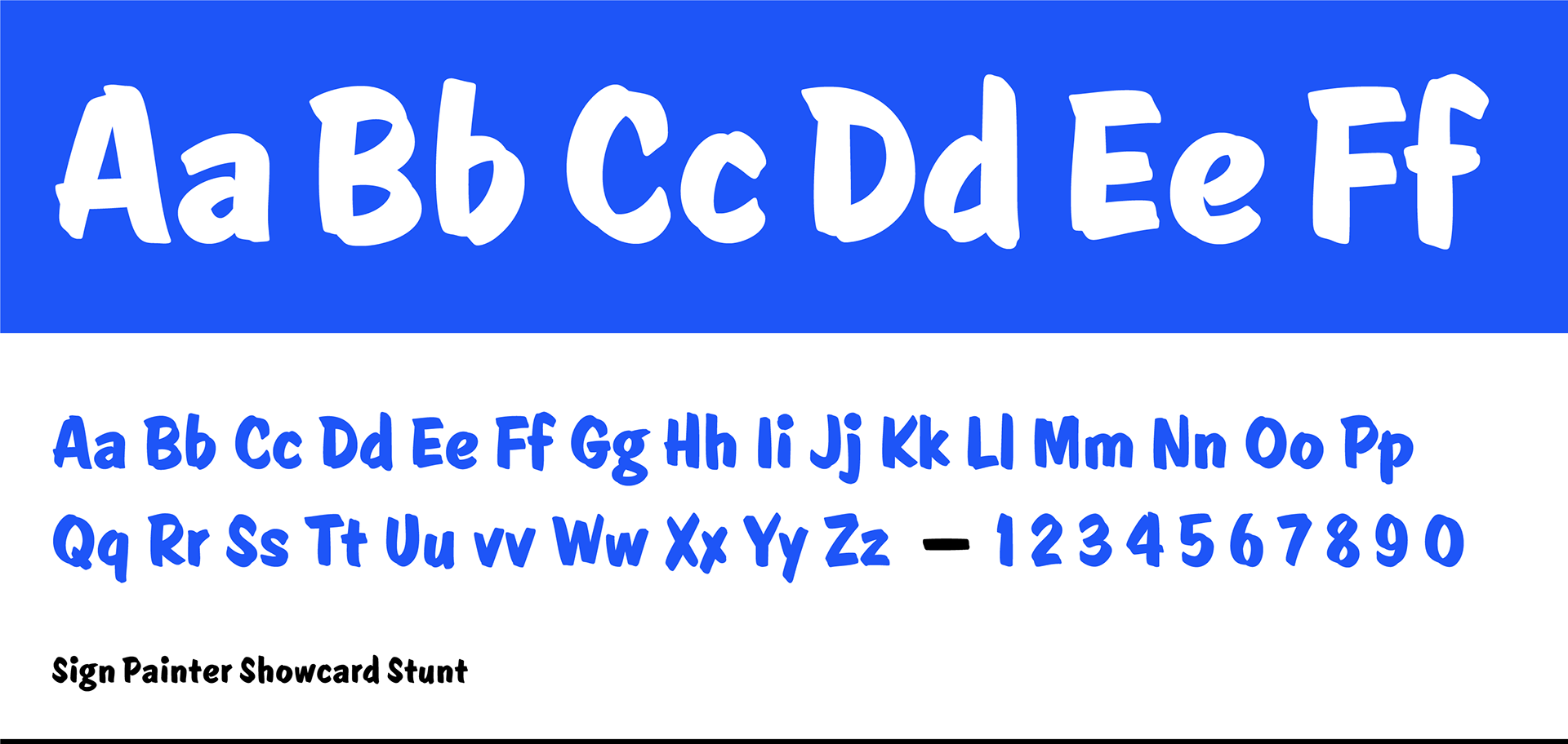
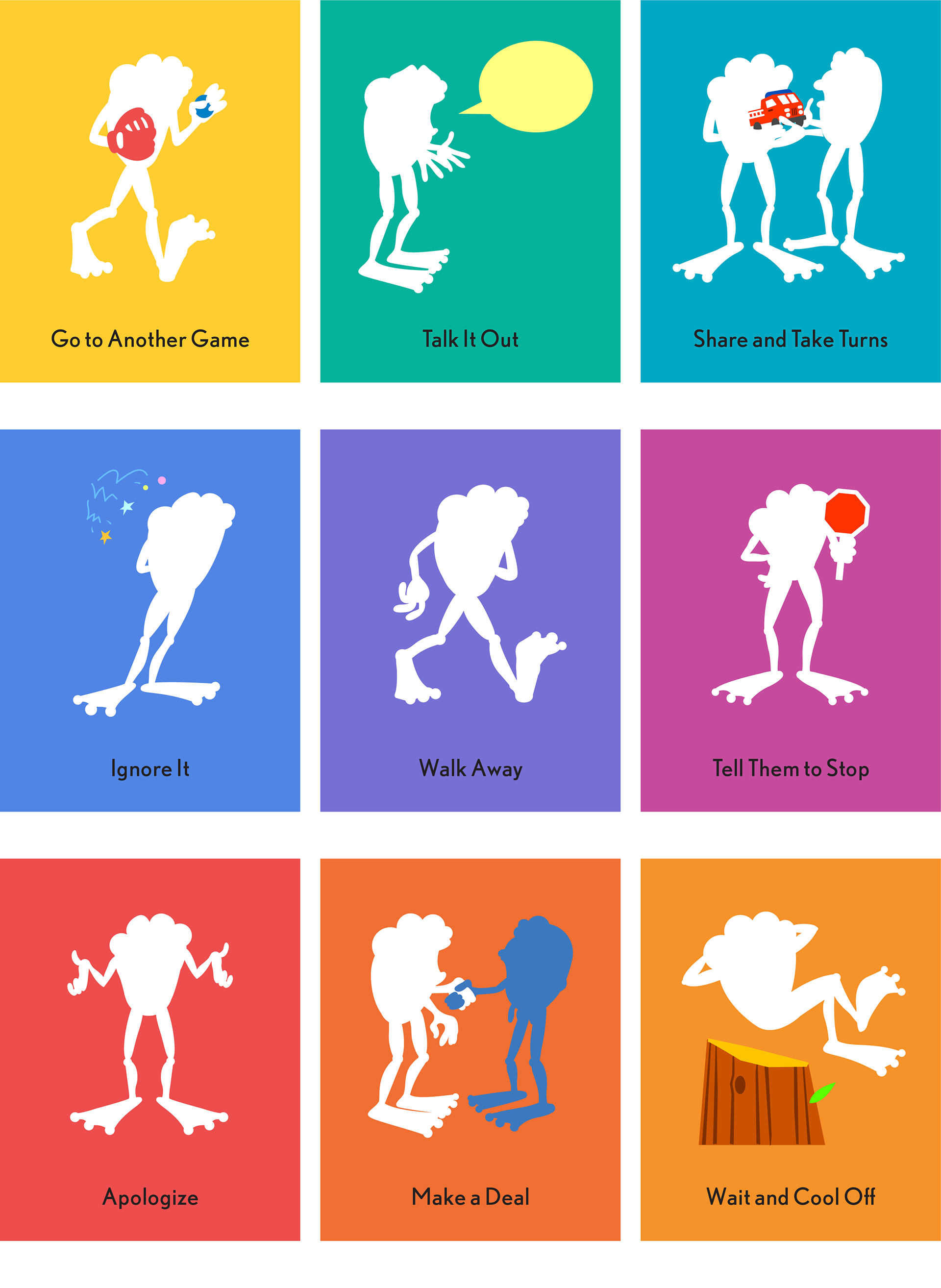
The starting point was the frog mascot, Kelso, drawn in a comic book style. The elements I built up around the mascot were contemporary takes on nostalgic, modernist aesthetics. A version of Helvetica that looks roughly drawn from memory. Super clean sign painting fonts, lots of geometric shapes, flat vector silhouettes, and lots of pinks, magentas, bright greens.
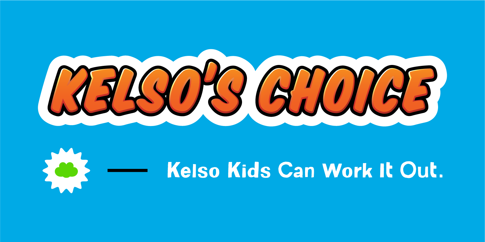
Key Lockup — This combination of logotype, mark, and tagline is the ideal branding layout. We used this for business cards and trade show table skirts. More often the three elements would be separated; with this logotype used as a header, and the tagline below the content as a sign off.
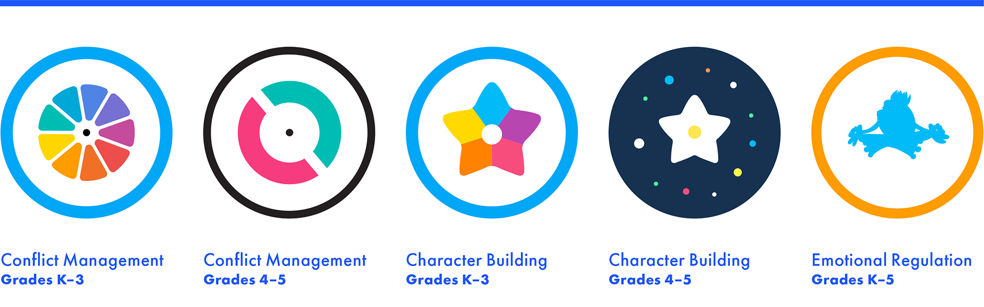
Program Icons — These 5 icons represent the three different programs under the Kelso's Choice umbrella. Conflict and Character programs have separate icons for K-3 and grades 4-5. The emotional regulation program is not split that way.
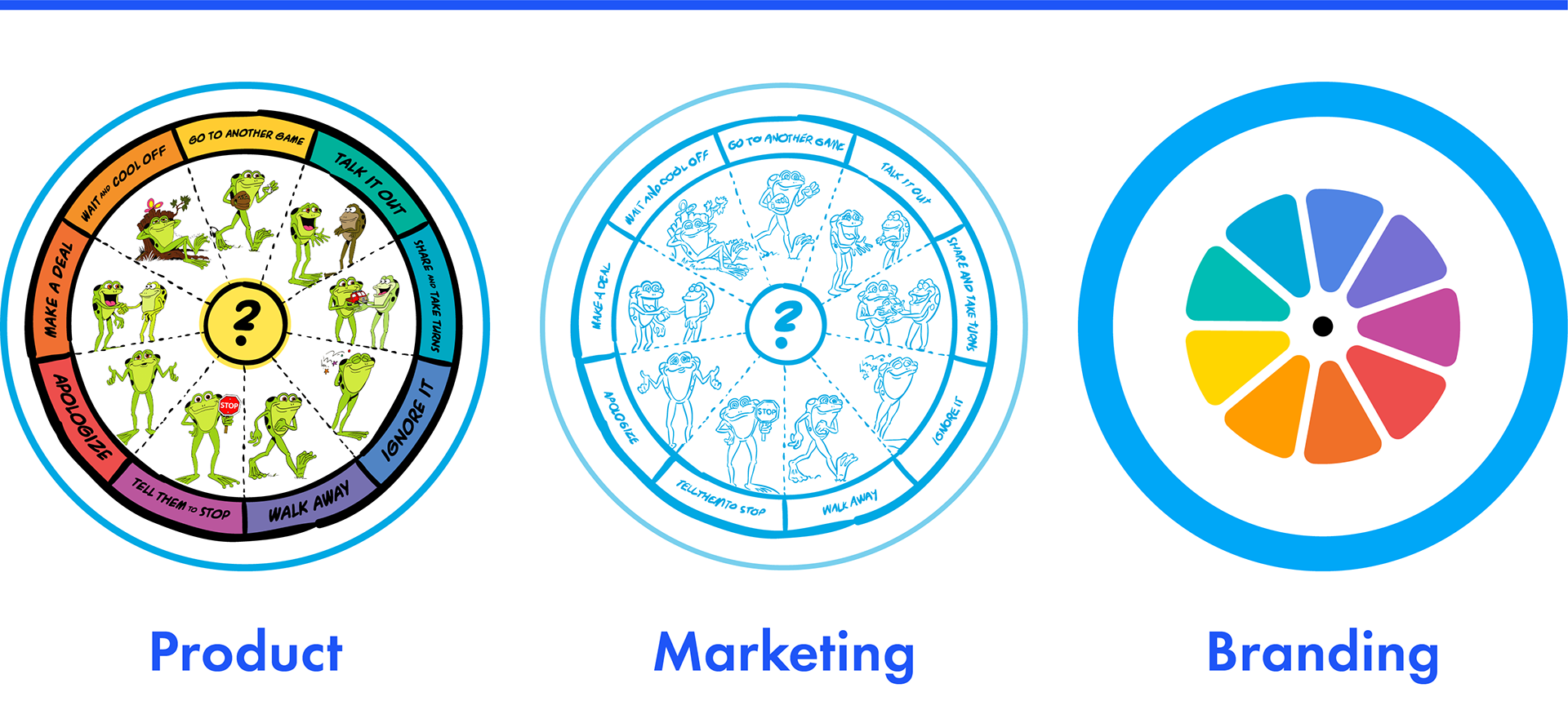
The Choice Wheel — This wheel is the most recognized part of the program. Adding colors to the choices was a first step to building the visual brand. The wheel palette is applied to products, marketing, and adapted into an icon for the conflict management program as a whole.
The messy, wonky “sketch”rendition of the wheel deepened the visual grammar of the brand. I used it to create narrative images about the program rather than simply showing the product itself.
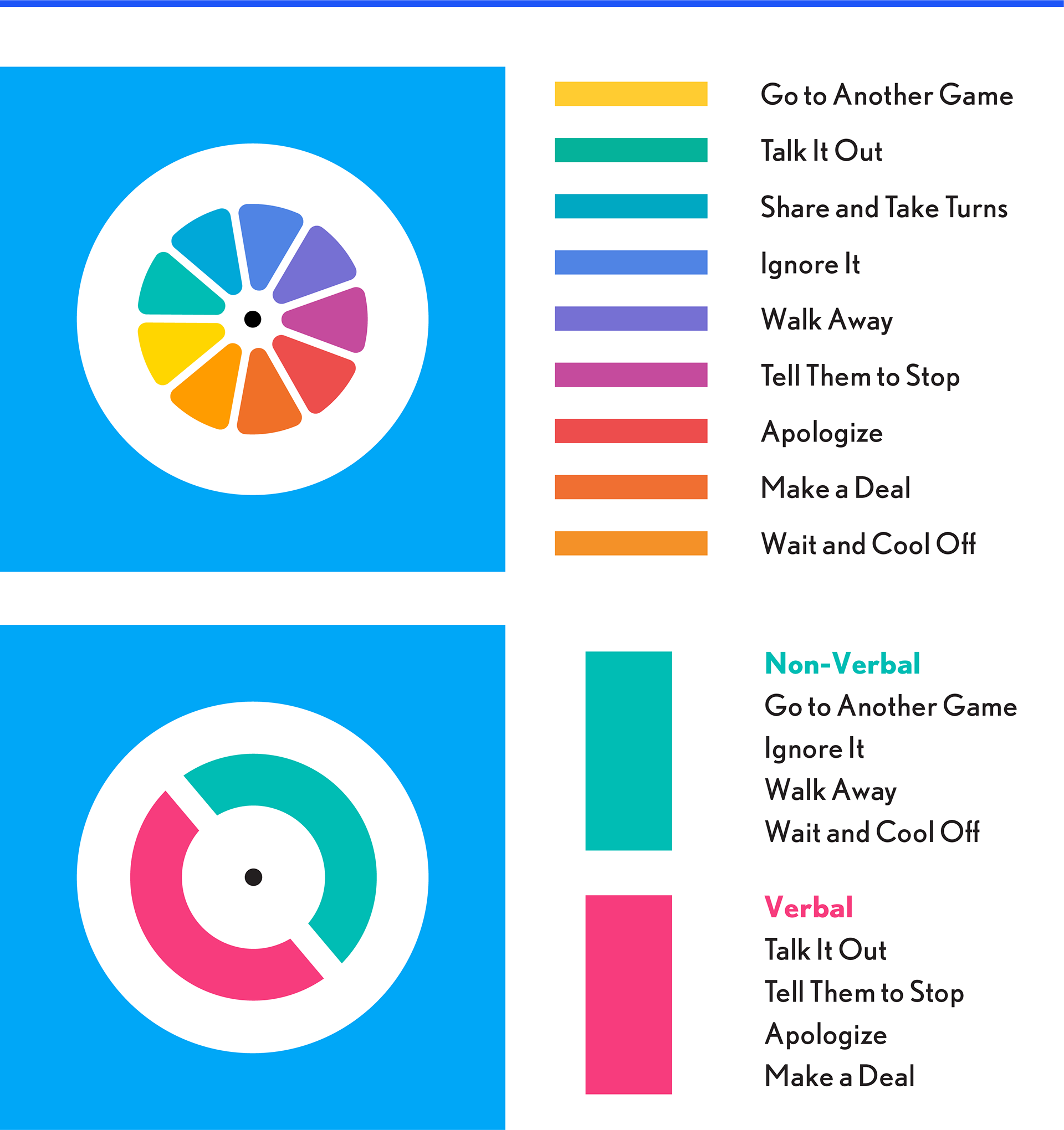
The Choices — Kelso's Choice refers to these "choices" that K-5 students can make to manage small conflicts. This brand is so well identified with early elementary curriculum, that we needed to make an effort to highlight our offerings for grades 4-5.
Silhouettes — There is tension in marketing products for children to highly educated adults. These images gave us a more sophisticated way to present the program.
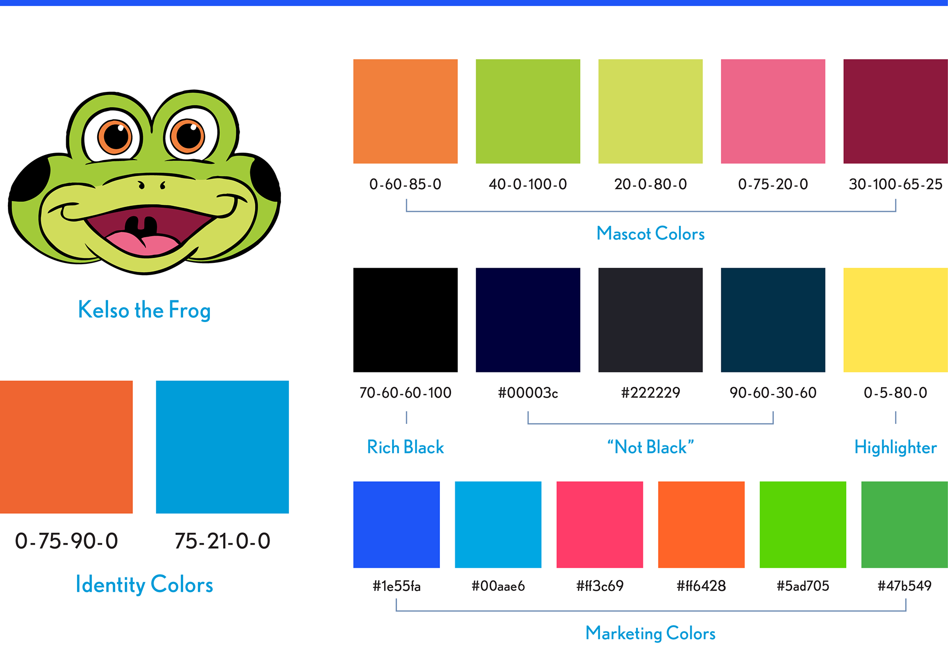
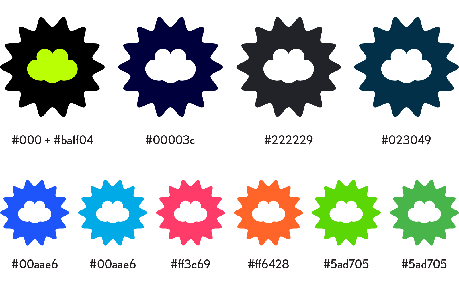
Color Palettes — Color is the backbone of the brand.The Kelso frog mascot is central to both product and communications. All other palettes are chosen in relation to these five colors.
Key Rules: 1) Red is nearly forbidden, 2) Yellow is limited and kept away from the mascot in general, 3 ) “Not Black” colors support the primacy of the mascot’s black outlines. Marketing is mostly digital, colors are close to fluorescent.
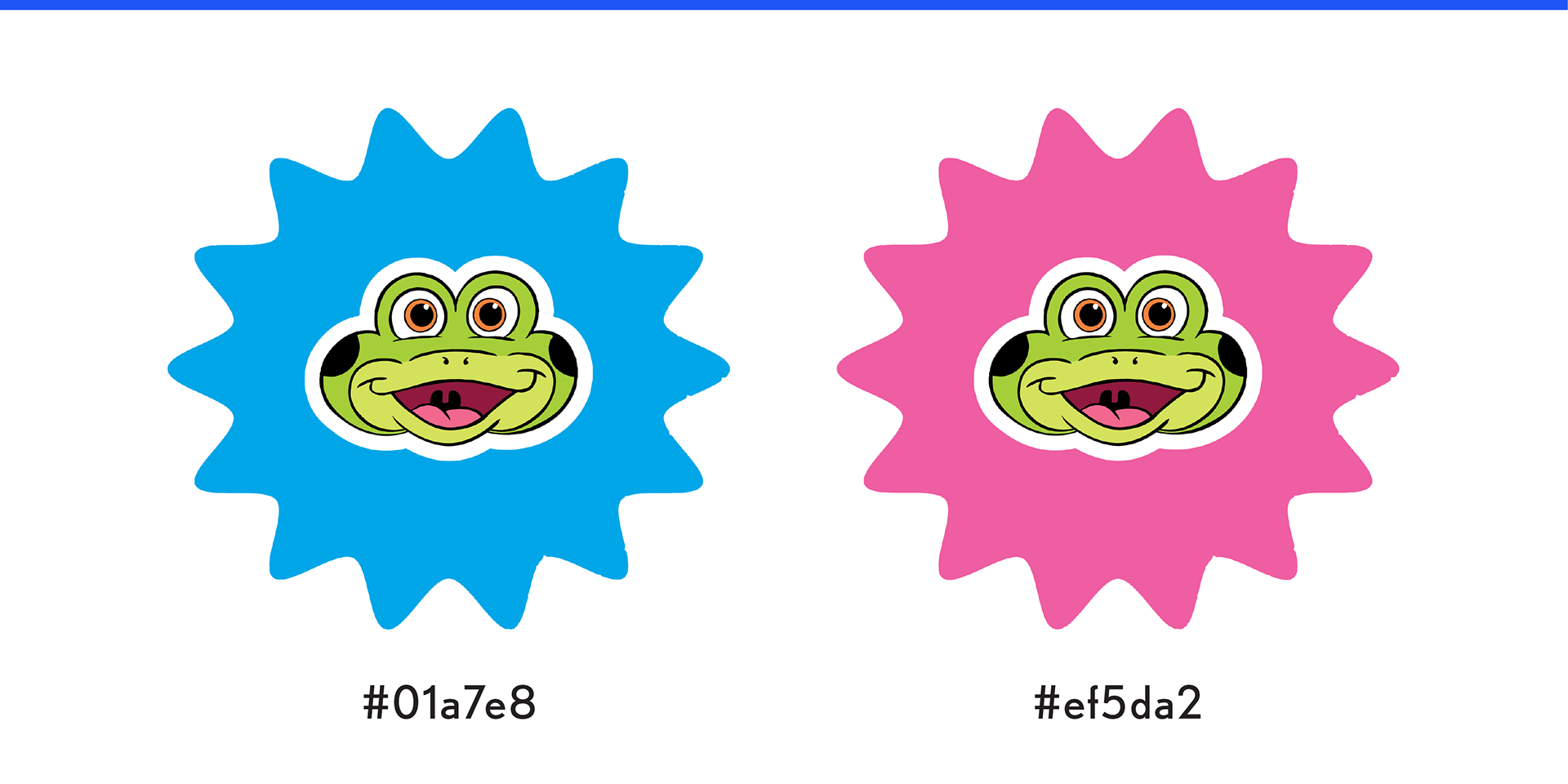
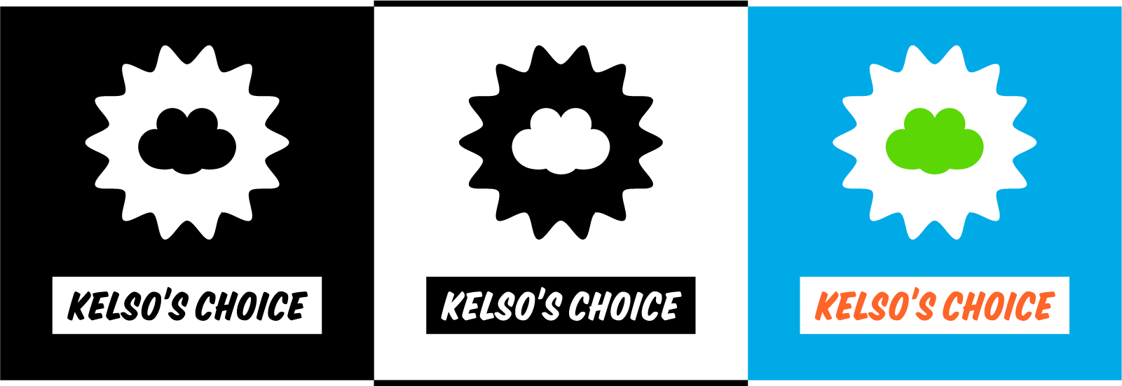
Large headburst icons — Kelso face drawn by Steve Harpster